Why Is There White Space on Shopify Mobile, and How to Fix it?
Optimizing the mobile experience for your e-commerce store is of utmost importance. However, you may have encountered a common issue on Shopify mobile—the presence of white space in the homepage or product page . In this article, we will dive into why white space appears on Shopify mobile and provide practical solutions to eliminate it, ensuring a seamless user experience for your customers.
What is the White Space Issue
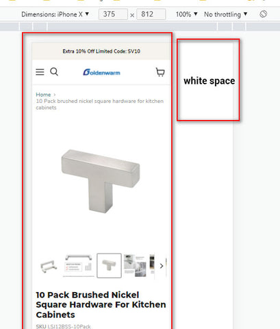
White space refers to the empty or blank areas on a webpage. On Shopify mobile, this can disrupt the overall design and negatively impact the user experience. Understanding how white space affects your website is crucial for addressing this issue effectively.
Common Causes of White Space on Shopify Mobile At Right Side Of The Homepage:
Responsive Design Issues:
Responsive design is vital for mobile optimization. However, certain problems can lead to white space. One such issue is improper scaling, where elements do not adapt correctly to different screen sizes. This can result in awkward spacing, leaving unwanted white space on the page.
Theme Customization Challenges:
Shopify allows customization of themes to align with your brand image. However, misconfigurations or incorrect modifications can inadvertently create white space problems in some Shopify sections. Inconsistencies in element placement or incorrect adjustment of padding and margins can lead to unpleasant white space gaps.
Content Formatting Errors:
Improper content formatting can introduce white space on Shopify mobile. Incorrectly aligned images, headings, or paragraphs can disrupt the flow of the page and generate unwanted gaps. Proper attention to element spacing and alignment is essential for a visually appealing mobile layout.
Resolving White Space Issues on Shopify Mobile:
Utilizing Responsive Themes:
Choose responsive theme templates designed specifically for mobile optimization. These themes adjust elements automatically to fit various screen sizes, minimizing white space issues. Popular responsive Shopify themes include Supply, Turbo, and Debut, to name a few.
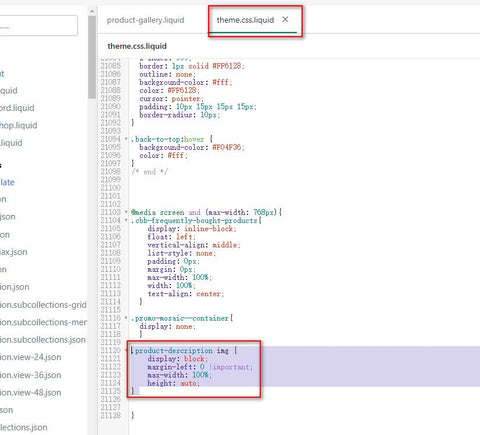
Customizing CSS and Page Structure:
Customize your Shopify store's CSS code to tweak spacing and eliminate white spaces. Adjusting margins, padding, and element alignment can help achieve a more visually balanced mobile layout. Additionally, optimizing the page structure by properly nesting elements will enhance the overall design.
1. Generally,add the code below:@media screen and (max-width: 768px){
body, html{
overflow-x: hidden;
}
}
2. In this case(Empire theme), I added the css code below to the section css or theme.liquid.css file instead:
.product-description img {
display: block;
margin-left: 0 !important;
max-width: 100%;
height: auto;
}
Testing and Debugging:
Thoroughly test your Shopify store on multiple mobile devices and browsers to identify any persisting white space issues. Utilize developer tools and debugging techniques to pinpoint and resolve the problems effectively. Regular testing ensures a consistent and pleasant user experience.
Best Practices for Mobile Optimization:
Apart from addressing white space, consider implementing these best practices for overall mobile optimization:
- Optimize page load speed: Compress images, minify CSS and JavaScript files, and leverage caching techniques to improve loading times.
- Implement intuitive navigation: Ensure easy navigation and a user-friendly interface to enhance the mobile browsing experience.
- Utilize image optimization: Optimize images for mobile devices by compressing them without compromising quality, reducing their file size and improving load times.
Conclusion:
White space on Shopify mobile can hinder your e-commerce store's user experience and aesthetics. By understanding the causes and implementing the solutions mentioned in this article, you can eliminate white space issues and create a visually pleasing and responsive mobile website. Prioritize mobile optimization, and your customers will enjoy a seamless shopping experience on your Shopify store.


